


Y Spend Less? On the Designer Behind the YSL Logo
The iconic interlocked letters of the Yves Saint Laurent logo are among the most recognisable emblems in fashion history. What many may not realise is that the logo was created not by a 20th-century fashion insider, but by a modernist graphic designer born at the dawn of the century.
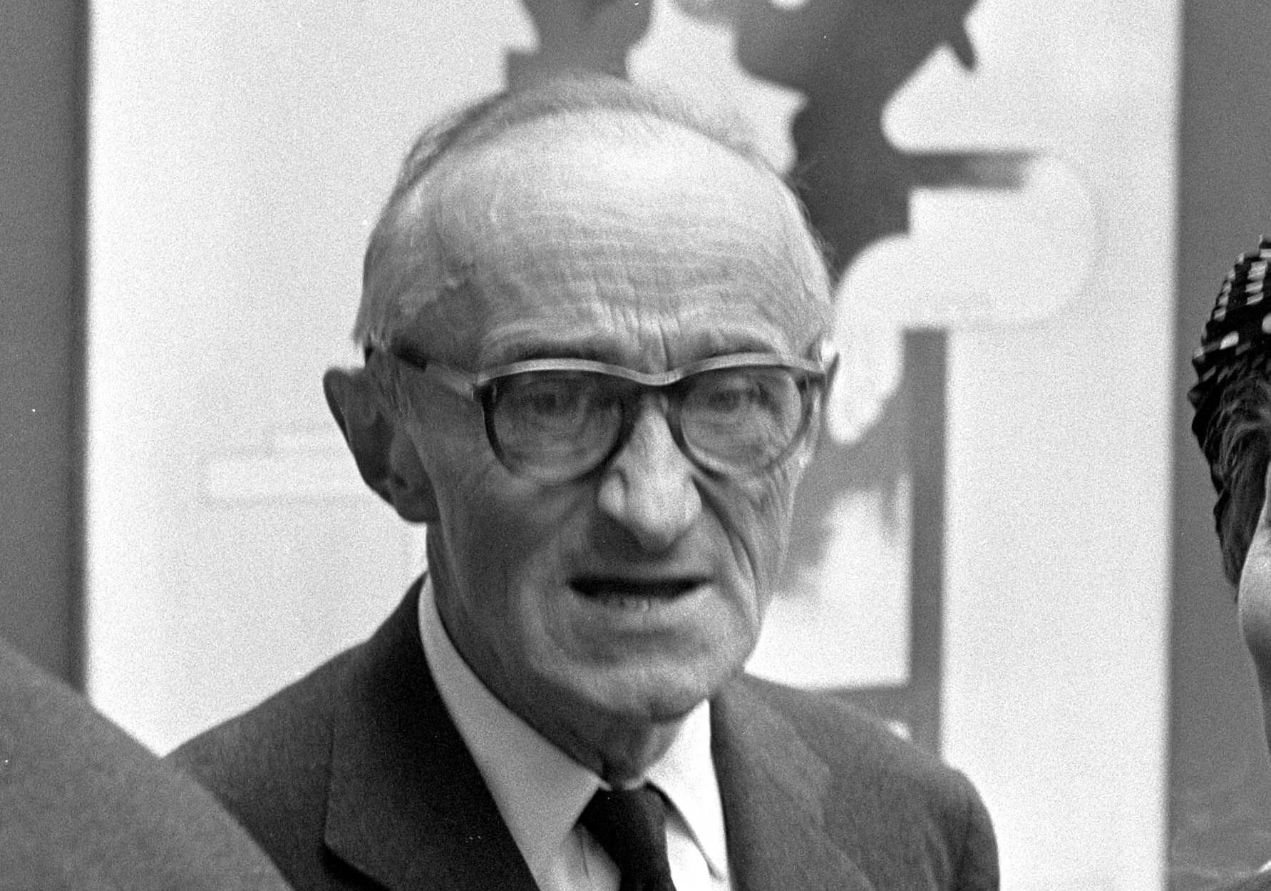
Cassandre, born Adolphe Jean-Marie Mouron in 1901 in Ukraine to French parents, became one of the most influential figures in early graphic design. He moved to Paris to study at the École des Beaux-Arts and swiftly built a name for himself through his bold, architectural compositions. He co-founded a graphic design agency and produced work for Dubonnet and other major clients, quickly becoming known for his striking visual language.
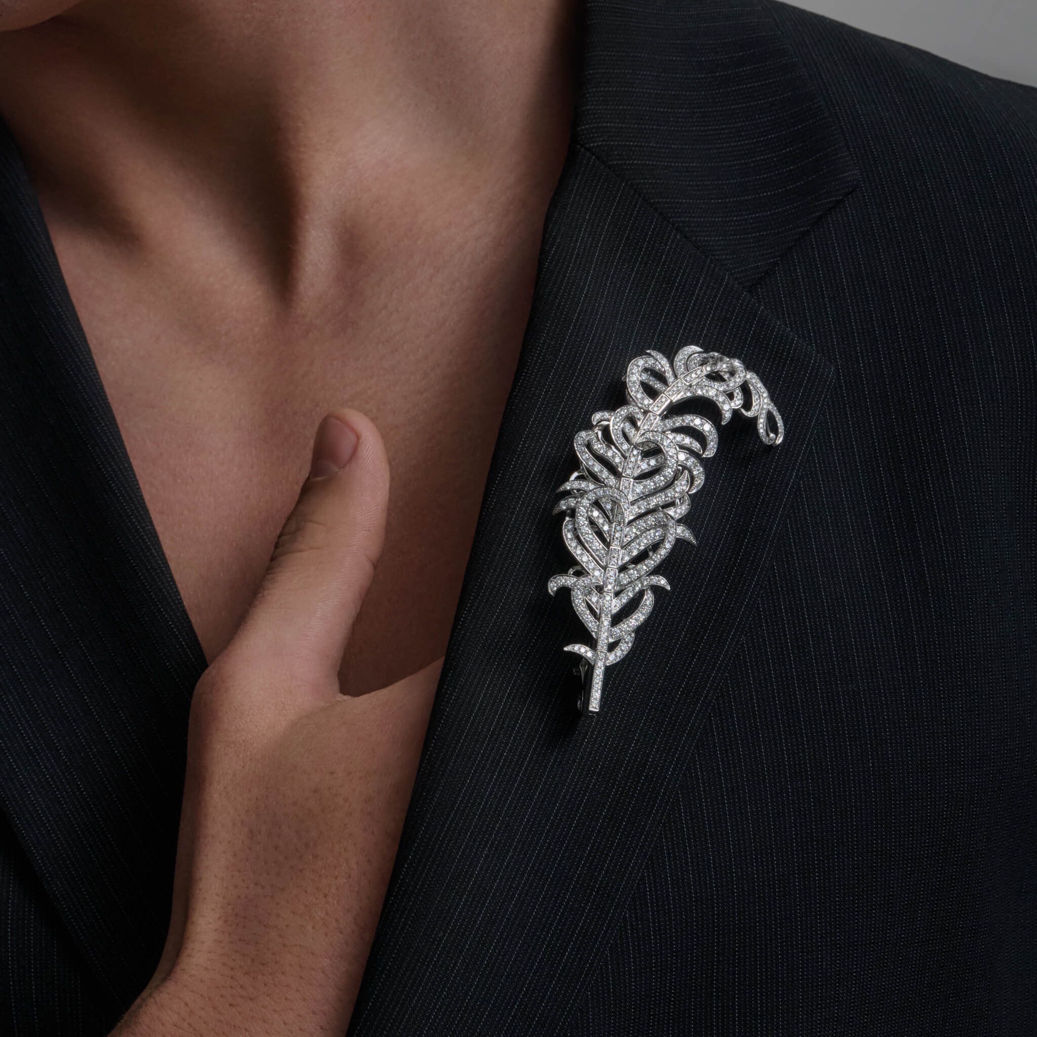
In his early career, Cassandre designed two innovative typefaces, Bifur and Peignot, which helped to define the visual style of the 1930s. His work extended beyond posters and typography; he also designed scarves for Hermès and, most memorably, the logo for Yves Saint Laurent. Commissioned in the early 1960s, the YSL monogram is an elegant and enduring expression of modern luxury, as relevant today as when it was first unveiled.
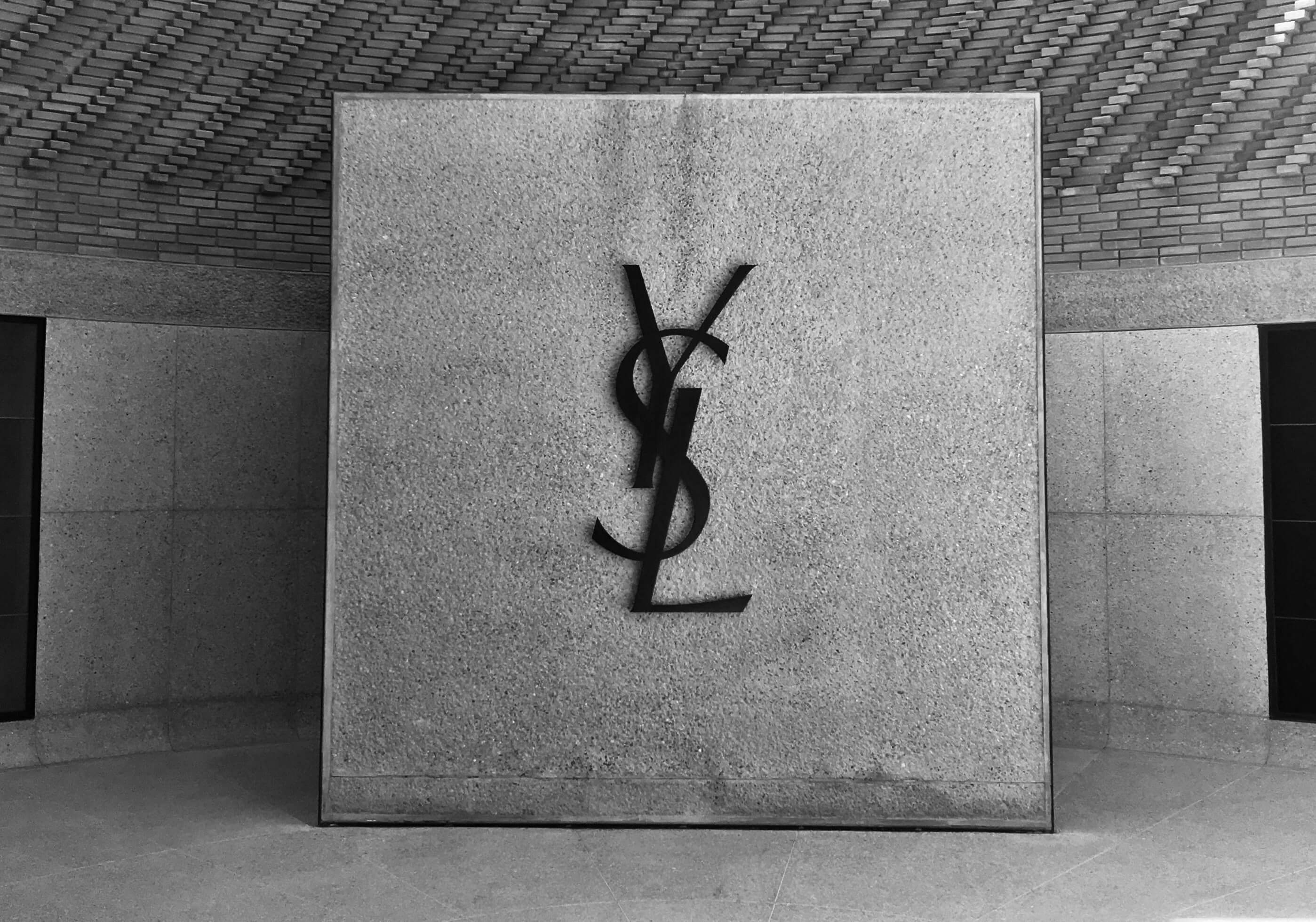
There is a quiet irony in the fact that the logo was designed by a man named Cassandre, so close in name to me - the coincidence has always amused me.
A French friend once told me that the logo’s three letters are sometimes read, with a typically Gallic shrug, as a dry remark on luxury itself: Y spend less.
It is, perhaps, a perfect encapsulation of fashion’s enduring paradox - a blend of wit, art and unapologetic desire.
Read more

MoSuke: A Franco-African-Japanese Gastronomic Experience
Discover more about the restaurant, MoSuke, which earned France's first Michelin star serving west and central African cuisine.
Read more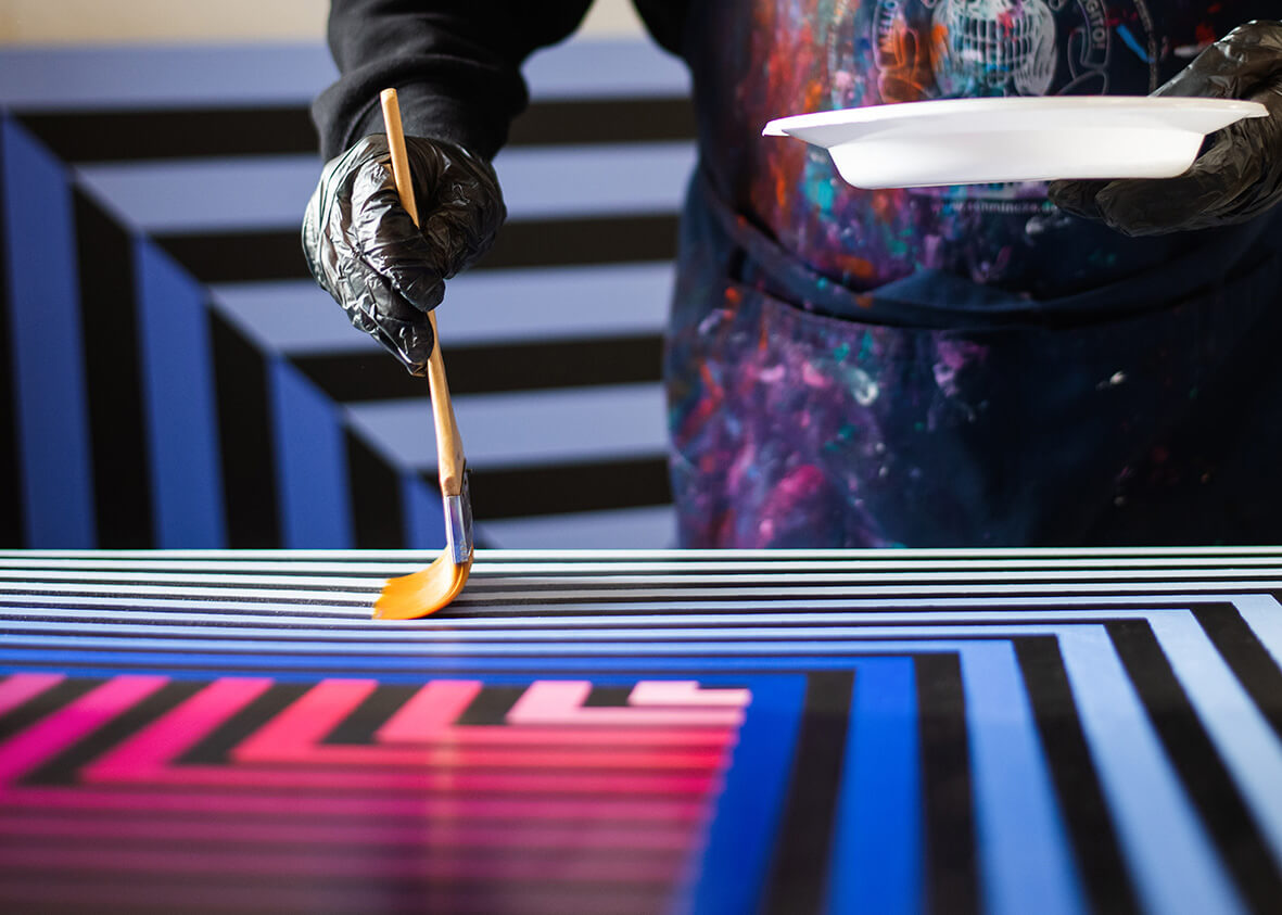
The Vibrant Vision of Argiris Ser
Discover Argiris Saraslanidis, known as Argiris Ser, a transformative force in Greece’s urban and street art scene.
Read more